Instagram's new look - beginning of an era, or end of one?
Instagram has changed! Right from its inception, many things had changed, but the one thing that remained was its app icon which had literally become iconic in itself. To many it not only represented Instagram, but also photography itself.
So how did this all happen? And most importantly why?
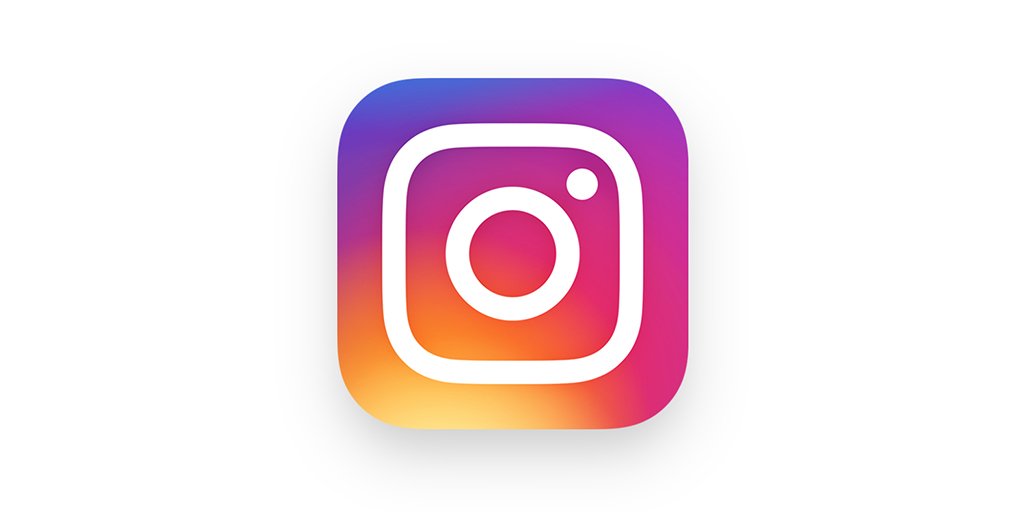
So I got an email from Instagram today morning, announcing a completely new look for the app - starting from a new app icon/ logo!
The camera in the icon is now simplified (read more abstracted) and the colors have become way more vibrant, taking on the hues from a rainbow, with a dominating purple.
But why the change?
Well, any change seems unnecessary, especially when you love the current design and don't see the need for something new. However, look closely and you will see that for an almost omnipresent app, this also represents getting younger in a way, and also a method to connect with the newer audiences.
The design might look a bit kitsch, but it certainly grows on you pretty fast. Remember when iOS changed to bright colors? Now I can't even imagine going back to the old design.
This is the how the app looks now on your phone. What! You don't follow me already? Do it now (click on the image below and check out my profile).
 |
| My instagram! |
Feedback to the new Instagram logo?
But how do the current users of Instagram connect to the newness in the app. Looking at the comments on their video on Instagram, the world seems to be split. Some are desperately begging Instagram to change back to the earlier design, while others are embracing it wholeheartedly.
Here are some of the most recent comments to the video below. By the way so far there have been 87,000 comments and most seem to hate the new logo! I think it's a matter of time before we all start loving it :)
Y'all keep on changing stuff without at least the consideration of the users... Just be like every other social media site and stop updating everything!!!!!!
The new logo is not bad but the original is too good.
The logo: Why not. But this interface has so much white, it's strange and awful.
Good job
It looks like a washer machine! Not a Polaroid!
I dont like it sorry, i dont mind the update but plz can you change the app logo thing back please, im begging you. Or i think people should be able to go on there profile settings and change it to one of the two logos 😊
Here are some of the users who loved the logo and showed their love through their creativity.
 |
| Love for the new Instagram logo! |
So what do you think? Share your views in the comments below
I do IG, but not very active, so I haven't seen the changes just yet.
ReplyDeleteThis is going to be some way to how to hack a instagram account online.
ReplyDelete